General features
Overview
This chapter covers universal features and functionalities that remain consistent throughout the application, regardless of the specific section you are accessing.
3.1 Icons

SAVE.
Icon used to save a new entry or confirm modifications.

DELETE.
Icon used to remove the corresponding row or record.

EDIT.
Icon used to access the editor and modify the corresponding record.

ACTIONS.
Icon that opens a menu of contextual actions (3 vertical dots), for example for the table's row additional actions.

CREATE NEW.
Icon used to initiate the creation of a new record.

DATE AND TIME PICKER
Icon used to open the date and time picker.
3.2 Tables
Data tables across the application share the same logic and functionalities.
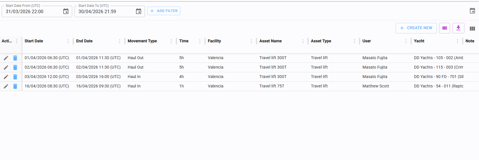

Configuration and export icons are located in the top-right corner of each table.
3.2.1 Table configuration

Clicking the configuration icon opens a pop-up menu where you can customize the table layout to suit your preferences.
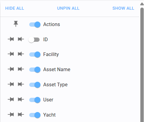
Column Visibility
Toggle the switch next to a column name to show or hide it:
 Switch ON: Column is visible.
 Switch OFF: Column is hidden.
Pinning Columns
You can fix columns to one side for better navigation:
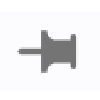 Pin Left: Keeps the column fixed on the left side while scrolling.
 Pin Right: Keeps the column fixed on the right side while scrolling.
Configurations can be saved for future use (see section 3.2.2).
3.2.2 Save table config

Clicking the purple configuration icon opens a pop-up menu where you can save your table configuration.
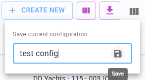
To save your current layout, click the "Save Configuration" icon.
Enter a name for your custom view and click the save icon to complete the process.
You can save multiple configurations and toggle between them using the same menu.
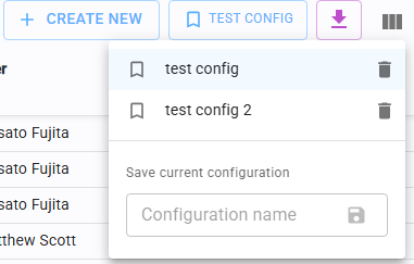
If a specific configuration is active, it will be highlighted in the UI.
Important: Saved configurations are device-specific. They are stored locally on the browser/device you are using and are not synced across different devices. If you log in from a different device, you will need to re-configure your views.
3.2.3 Data export

The export icon allows you to download the data currently displayed in the table.
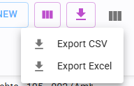
The system exports only the results based on your active filters. Important: data not loaded in the browser will NOT be exported. Formats: Data can be exported in CSV or Excel format. Click the respective format icon to trigger an automatic download.
3.3 Lists
Certain sections contain lists that can be manually reordered using the movement icons:

Move Up: Shift the item higher in the list.

Move Down: Shift the item lower in the list.
3.4 Filters
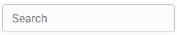
FULL TEXT SEARCH
Searches for specific text within a defined field.

This may be located in the sidebar or directly beneath the column header in a table.
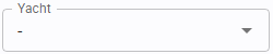
DROPDOWN
Allows selection of a value from a predefined list.
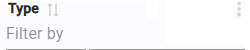
Includes a full-text search function within the menu for quick selection.

SWITCH
Binary state. True when active (ON - blue), False when inactive (OFF- grey).

CHECKBOX
Used for binary selection. Checked for True, Unchecked for False.
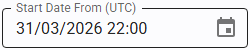
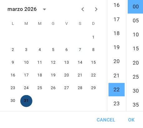
DATE AND DATE RANGE
Dates can be entered manually via keyboard or selected using the calendar pop-up.
Time Zones: Time is displayed according to the time zone assigned to the facility currently being viewed.
Timestamps always include the reference time zone (e.g., UTC) to avoid confusion when working with multiple facilities at a time.
3.5 Custom filters
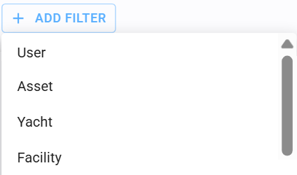
In specific tables, you can build advanced custom filters:
Click "Add Filter.
Select the desired column from the list.
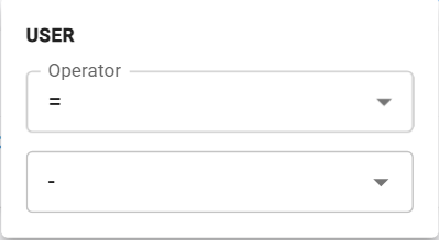
Choose a logical operator (e.g., Equal, Is Empty, Contains).
Enter the required value.
The active filter will bedisplayed in the filter bar for easy management.
3.6 Upload files
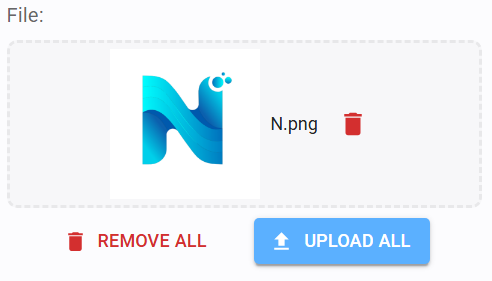
Select File: Drag and drop the file into the upload box or click to open the file browser.
Upload: You must click "Upload All" (or "Upload" for single files) to process the file.
Note: Seeing a preview of the file after dragging it does not mean it is saved. If you save the main form without clicking "Upload," the file will be lost.
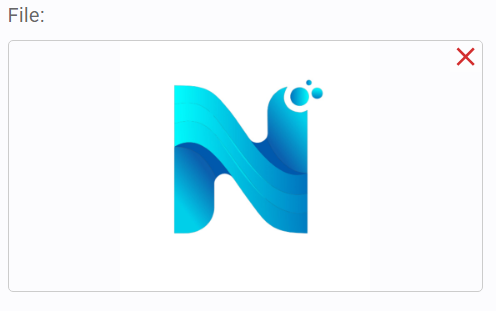
Successful uploads are displayed with a file summary.
Click the Red X icon in the top-right corner to remove an uploaded file.
Always remember to save the section after the upload is complete.
3.7 Preview documents
The application provides an integrated preview for attachments. The viewer adapts based on the file format
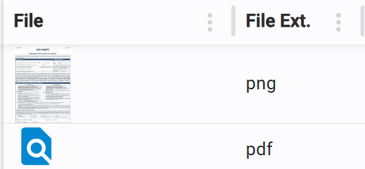
IMAGE FORMAT PREVIEW
Direct visual display of image files.
FILE PREVIEW
Integrated viewer for PDFs and other document formats, allowing you to inspect content without downloading.